
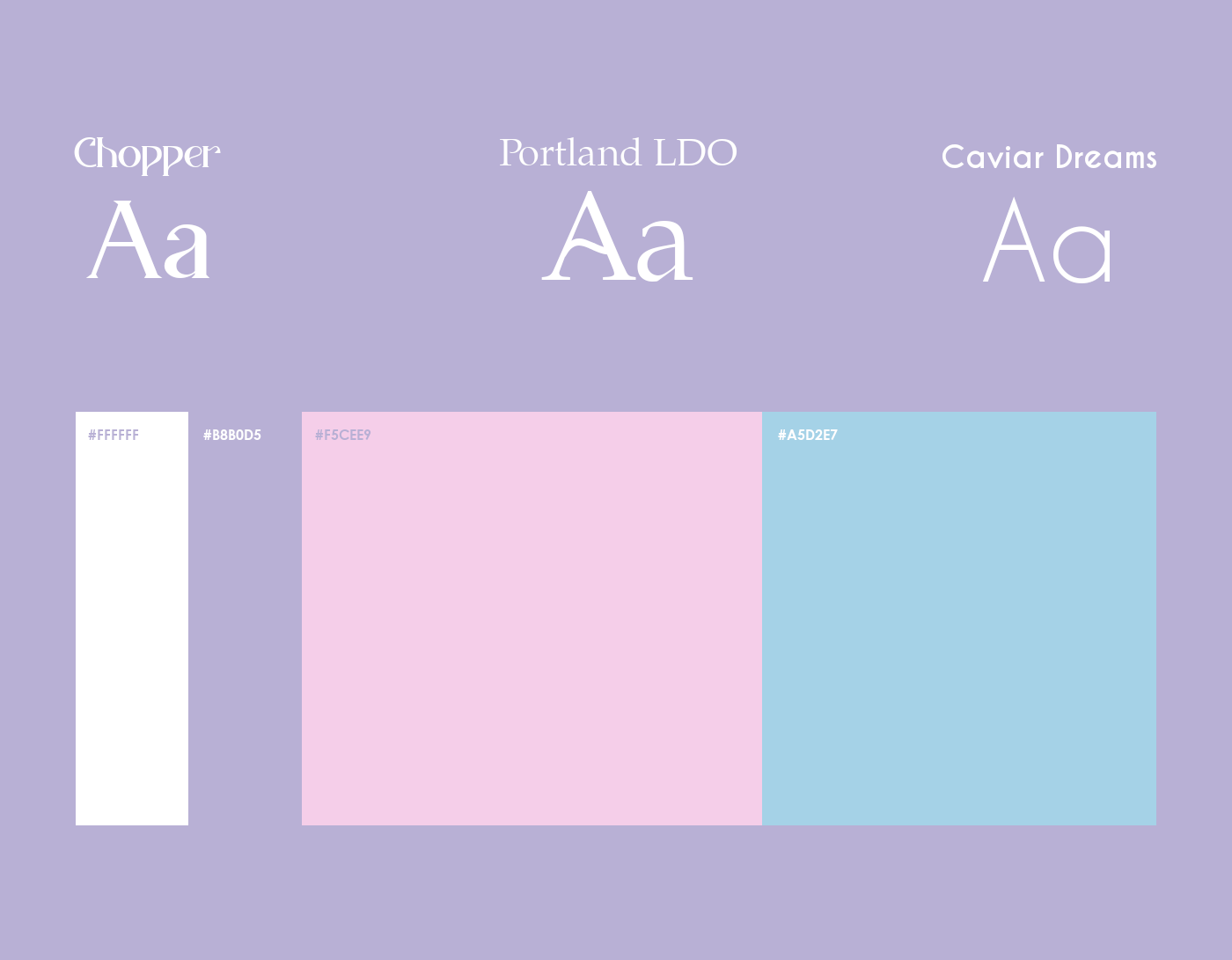
ABOUT THE BRAND
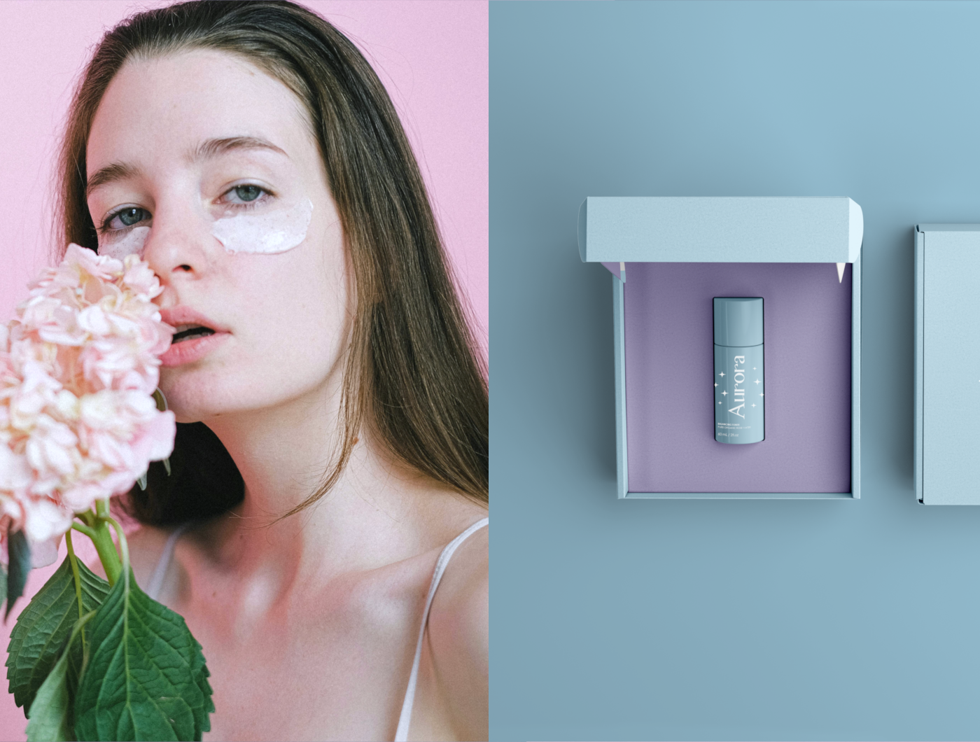
Aurora is a skincare brand that captures the essence of a magical snow-covered world through its enchanting visual identity. Drawing inspiration from a winter wonderland, the brand is characterized by a soft pastel color palette, featuring shades like lilac, pink, light blue, and white. This delicate color scheme evokes a serene, otherworldly ambiance, perfect for a brand focused on gentle and transformative skincare.


LOGO CONCEPT
The logo for Aurora is designed to embody both magic and elegance. The font chosen for the logo carries a whimsical yet sophisticated vibe, enhanced by the addition of sparkles that dance around the letters, evoking the twinkle of falling snowflakes. The main logo prominently features light blue and white, reinforcing the brand's connection to the ethereal beauty of snow and ice.

The brand incorporates two distinctive patterns into its visual identity. The first pattern showcases the "A" from the brand’s name, surrounded by the signature sparkles, creating a motif that is both recognizable and enchanting. The second pattern is composed solely of these sparkles, arranged in a way that simulates the gentle descent of snow, further emphasizing the brand's wintry, magical theme.